Updating our Solar Dashboard to ePaper
Necessity is the Mother of…
We have a home solar/battery setup. I capture data from it1 and store in a time-series Influx database. Covers all aspects of generation and consumption measured at the house/grid/generation interface2.
Naturally I like to visualise this. So of course I’ve built some Grafana dashboards. These work great on a computer or tablet (or even, at a pinch, on a phone if you’re prepared to scroll around a lot…)
Dashboard Mark I
I re-purposed an old Android tablet to auto-launch into Chrome and display a custom-sized dashboard of relevant stats for “today” (with all values clamped to midnight). Worked pretty well, if I say so myself, especially using Grafana’s auto-refresh feature to self-update every minute.
It looked a lot like this:
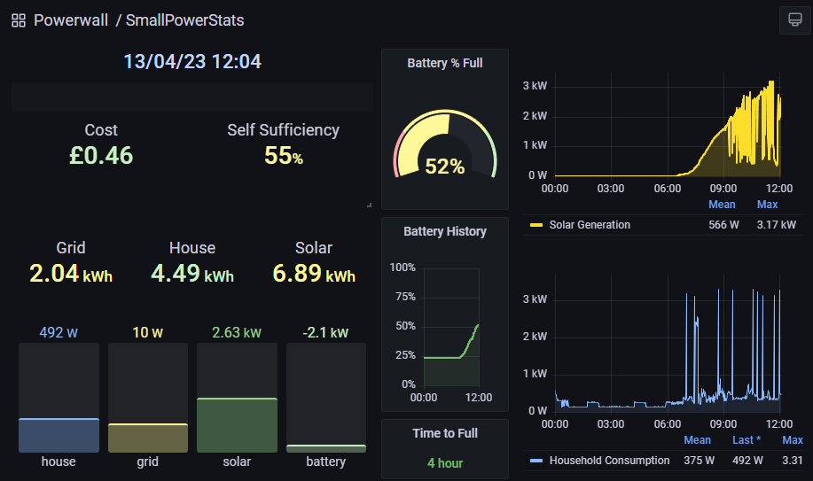
This sat in our Kitchen, next to the “black box” provider-supplied Smart Meter display3 and provided all sorts of information while I wash the dishes. Worked well for about a year or so. Unfortunately, as is the way of all older cheaper Android tablets, running 24/7 on USB power meant Bad Things happened to the battery. In this case it started to swell up. So the device had to go (…into a bucket of sand in a dry but fireproof location until I can safely dispose of it).
Dashboard Mark II
I’m not made of money and I don’t have any spare tablet-sized devices (7” screen or up) that I can just re-purpose to use as a dashboard. I mean I could buy one but seems like a waste of a decent device really… and I’ve got all these components lying around….
Fundamental to the Mark II implementation was the finding that a previous project - an ePaper “communal calendar” - had been Comprehensively Rejected By The Rest Of The Family4. This meant I had a display infrastructure available, with nothing to use it on. Sometimes, the project specifications write themselves…
Architecture
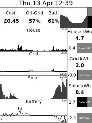
The Pi Pico - especially using microPython - doesn’t have enough memory to do it all itself. There’s no way (that I can see…) that you could load a Grafana dashboard on it. And that’s before you consider the translation from “full colour” to 4-level black-and-white. Or the fact that the little 4.2” display is only 400 x 300 pixels.
I did investigate whether I had enough “headroom” on the device to load a REST API infrastructure that would let me directly query Influx from the Pico and build a dashboard for myself. And the answer turns out to be: no, not by a long shot. The ePaper API only has some very basic primitives and takes a lot of the available RAM. There’s no headroom for much else there; even loading the JSON containing the data from Influx would frequently run out of memory on the device.
So, just like for the Calendar project, we’re back at a client-server architecture. Fundamentally the dashboard solution boils down to just enough micropython on the Pico to (perodically; every 5 minutes) connect to WiFi and query a (hard-coded) URL to get a (zLib) compressed 2-bit-per-pixel bitmap across and then blast that onto the ePaper display. There’s very little error checking done on the actual data received so the solution is quite tightly-coupled. But, hey, I’ve only got 1 server and 1 client and it’s a home project, where’s my motivation to make it scale or be device-independent?
I’m slightly prouder of the server-side solution. This implements a really, really simple web server that, on reception of a valid request generates a bunch of REST API calls to the Influx database to gather the data, does a bit of maths to summarise / scale it out5, and then uses the Pillow library to generate an image of the dashboard. I wouldn’t describe myself as a graphics wizard - either technically or artistically - and indeed I’ve often gone out of my way to avoid having to do this stuff, but I’m actually pretty pleased with the results. Some nice routines to draw graphs, a bit of styling and layout math to make the display (theoretically!) scalable and device-independent, and all fairly performant6. And the nicest thing of all about this approach is that you can tailor the output based on the query. A simple url-parse and I can generate a PNG image instead of the ePaper’s output format which makes debugging a breeze and also allows for easy screenshot capture:
Results
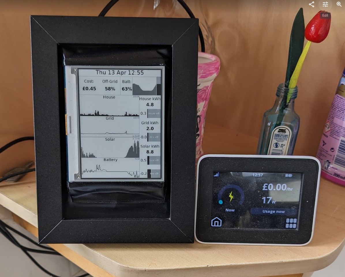
Wary of upsetting Dearly Beloved, I tried to make the actual device as aesthetically pleasing as I know how. This meant buying a picture frame, and (rather crudely) mounting the ePaper display within it (with the PiPico and battery on the reverse side). Let’s be honest I’m never going to win any design awards for this but it’s better looking than most of my projects. And, most importantly of all, so far it’s not caused any complaints from The Other Householders:
In case you missed the link above, all the code for this project is On Github in the “pwrdash” repository
-
One day I’ll get around to documenting it. It’s not as clever as it could be - it’s a Python script to poll the Powerwall’s REST API and funge the results into some nice time-series updates to Influx. Scheduled on a minute-by-minute basis using ‘'’crontab’’’ of all things. ↩
-
So the data’s complete from the point of view of consumption if not enabling break-down by consuming devices. One day I’ll get around to fixing that too…. ↩
-
Great for showing you the grid side of things, especially how much it’s costing you, but gives no information on anything else. On a nice sunny day, just shows “zero consumption” when the panels are working… ↩
-
Both on practical (“That screen is too small to read anything!”) and doctrinal (“No more of your electronic crap in my kitchen!”) grounds… ↩
-
I decided that, except for the daily summaries, everything looks better if I actually use last-24-hours data for this instead of “since midnight”. For things like Solar generation and battery state-of-charge this is much better at giving a how-are-we-doing-today-compared-to-yesterday overview. ↩
-
Initially I thought it’d take so long to generate the dashboards this way that I’d have to do this on a timed basis, save the result either on disk or memory, and have external requests for dashboards use these cached results. In practice, dashboard generation is in the sub-second range (“Too fast to bother measuring”) so it’s generated on the fly in direct response to an incoming request. ↩