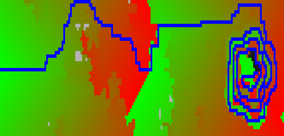
Visualisation of AOC 2022 Day 12
The Advent of Code problem set today was some old stuff about finding the shortest route to a high spot to get a mobile phone signal.
I’ve visualised the (full-scale) map and the path-finding process for the Part One solution; this year I’m writing it all in Go rather than Python so it was an Interesting Experience both :
- Re-implementing Dijkstra
- Attempting a visualisation in a compiled language.

Part One solution - shortest route from a fixed start point
This visualisation shows the evolution of the shortest found route to the defined goal from a fixed start point. The underlying heightmap is in grayscale (darker = higher). The cost-to-reach is in colour (costs increasing from green to red). What I like about this visualisation is how clever the chosen map is in terms of path selection - all points are “easy” (green) until right near the end where we have to spiral-climb up to our destination. I find this visualisation1 very satisfying…
The code used to generate this video2 is here: aoc2022/go/day12part1_visualisation.go
The ffmpeg command - referenced here because I’ll forget by next year, although it is in the code - is:
ffmpeg -f image2 -framerate 10 -c:v libvpx-vp9 -pix_fmt yuva420p \
    -i visualisation/aoc2022day12part1_%04d.png \
    visualisation/aoc2022_day12part1.webm
Part Two solution - shortest path from any lowest point to end point
The elaboration took the form of re-evaluating to find the shortest path to a fixed endpoint from any lowest point on the map. This visualisation of all the (viable) paths found isn’t as satisfying as the “search space” is a lot smaller than the numbers suggest - Part 2 uncovered a hidden assumption in my code that there was always a path to be found, and (given the movement restrictions made) that is not true. Once this fact was uncovered, only about 20% of “possible” start points result in any path to the summit, and (as this visualisation shows) they’re mostly clustered around the same start-point. Which is just another way of saying that this visualisation isn’t as satisfying either to make or watch as the part one video above… (note: the visualisation isn’t necessarily showing the actual shortest path, that proved to be a pain in the neck to extract given the code. Given the small range of routing paths found, though, it’s likely to be close to it…)
The code used to generate this video is here: aoc2022/go/day12part2_visualisation.go
The ffmpeg command is:
ffmpeg -f image2 -framerate 10 -c:v libvpx-vp9 -pix_fmt yuva420p \
    -pattern_type glob -i visualisation/"aoc2022day12part2_*.png" \
    visualisation/aoc2022_day12part2.webm
-
Unlike writing the solution, which was an exercise in self-inflicted frustration (hint: READ THE SPEC. And then READ THE ALGORITHM NOTES. And DON’T ASSUME ALL POINTS ARE REACHABLE) ↩
-
More accurately, the code generates a series of PNG file frames as intermediate results, and we later use an
ffmpegcommand to stitch them together into a webm movie. ↩