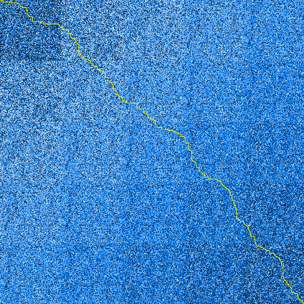
Visualisation of AOC 2021 Day 15, Part 2 answer
Updated with Animation of problem-solving, 2021-12-17 13:45
This one is something about safe routes through a cave, although given the cave “map” is algorithmically generated from a seed corner it all seems a bit unlikely. I’ve used colour to represent “danger” (darker=riskier) and the yellow line is the “optimal” route through the cave. Interestingly(?) there appear to be multiple routes with the same score; I had to adjust my route finding criteria to ensure I was selecting the same one as the web page selects for the example data (not least of all because my many, many wrong runs came to the right “number” for the example data but not via the right route).
The boundaries of the algorithmic expansion are more visible here than you’d think, less so when viewed full-screen.

Unlike previous days, this time the visualisation’s built in to the main problem solver; mainly because it takes so long to run (~1 hr) on the problem set that I was actually using the PNG output to assess the output quality.
An example of a wrong-but-not-by-much answer plotted with the wrong assumptions about path-movement is here:

Hopefully this shows why I was so convinced I was on the right track; the “score difference” for the two routes is 0.3% (difference of 9 in ~3000).
(If I was using this for the real-world then I’d definitely be using the simplified rules - the runtime for that “wrong” plot was ~5 seconds vs ~1 hr for the “correct” solution; definitely not worth it for the improvement)
The code used to generate it is here: python/day15part2.py
Showing My Working - animation of the problem-solving
I went back and found a couple of simple optimisations to make which reduced the processing time by well over an order of magnitude. And I saw some nice animations of the path-finding algorithm at work which piqued my interest so I felt obliged to have a go myself. Here’s the algorithm at work on my Part One solution:
I’ve processed this so that positions “under review” (actually recently-processed) are shown in grey; the total “cost” of the path from the origin (top-left) to a point is shown as a relative colour (green=low cost, red=high cost). This updates at each stage as the discovered costs evolve behind the “grey wall”. Un-evaluated positions are shown in their original colour (which maps to the “risk level” provided in the input), and the best-route-back is the cyan line.
Here’s the working for my Part 2 answer, which is a much longer animation (and thus a bigger file; 5 MB, be warned before clicking….)